
Lexie Wengenroth
Branding
A brief look into some of the branding I have done the past two years. Further details can be seen on any photo by clicking on the image.

ASUOP Creative Services


These are graphics that I used in the ASUOP Creative Services exhibition titled Creative LMNTZ which highlights the projects I have handled since being hired.


This was the original logo that we had to rebrand. We had noted that there were a lot of colors which would have made it more expensive to print, a gradient which can cause issues with printing, as well as an outdated typeface for a company that's focusing on cutting-edge tech.


NovaTech
This was the original logo that we had to rebrand. We had noted that there were a lot of colors which would have made it more expensive to print, a gradient which can cause issues with printing, as well as an outdated typeface for a company that's focusing on cutting-edge tech.
This was a group project where we had to rebrand (left) a fictional company's (NovaTech Solutions) logo. We had to come up with a new logo that fit their values (cutting-edge tech and sustainability) as well as provide a mockup of an app icon and splash page, website, brochure, and name plate. We then made a marketing campaign (right). My group chose to do a magazine ad, stationary, and car wrap.


NovaTech Website Prototype Link
Here are screenshots of the website prototype I worked on for this rebrand. I made sure that our website was formatted correctly for both mobile (left) and computer (right) and matched our logo colors. We also decided to include green since it could be used to represent both sustainability and technology. The link to the website is provided above.

I decided to keep with the circuit theme for this van mockup and moved the leaf to be included in the main circuit. I was told that this had to have three colors, so I used the two in the logo plus the green from the app.

Savora

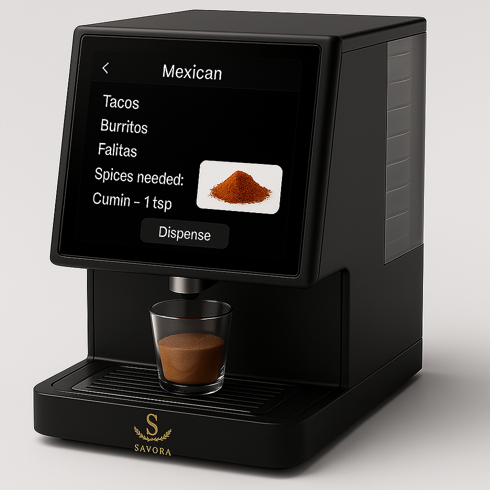


The second image in the gallery on the left was provided by the engineer team as what product another designer and I would need to create a brand for and advertise. We were told that the target audience were millennials who had disposable money and into cooking. For this we kept an elegant, modern feel to the brand. We also won audience's favorite at the PIES event that the product was pitched at. The specific things that I did are on the right while the left has everything that was developed for the brand.

This is the front cover for the menu that I designed. The gradient on the title of the restaurant was done in Photoshop, the graphics and boarder was done in Illustrator, and the rest was done in InDesign.

This page is meant as an 'about us' page. I decided to title it "Our Lore" to keep to the technology theme and seem kind of fun. All of the background and workings of the restaurant were completely made up, as it is a fictional restaurant.

I wanted the drinks to be on the last page since drinks are usually the first thing people order, and having it on the back makes it easier to find since all you have to do is flip the menu over. The QR code goes to a survey that allows customers to give feedback; whether positive or negative. I imagine this restaurant being new, so feedback would be important to them.
This is the front cover for the menu that I designed. The gradient on the title of the restaurant was done in Photoshop, the graphics and boarder was done in Illustrator, and the rest was done in InDesign.