

Design and Layout
I had learned a bit about Indesign and a little more about Illustrator in this class.
Project 1
For the first project, we had to make a package that included a person. We started off with drawing the person then thought about what kind of company and package the person would belong to. I chose to do something space themed.

This was the person that I created. The teacher wanted me to try to challenge myself a bit since I knew how to use the pen tool already. I decided to make the person hold something even though hands are hard. I included the mark on the neck since I had been drawing something similar on my arm at the time. I used gradients to help with the shading. I also tried varying the lines to make it seem more interesting.

This is the dieline for the package. Since I made the background of the person space themed, I figured the package should be too. I used the freeform gradient to try and get the galaxy behind the person to continue onto the other sides of the package.

This is how the package came out once it was printed and assembled.

The color wasn't exactly what I wanted, but I think it still came out alright.

I had chosen this package since I thought it kind of looked like a drop ship when it was open and spread out. Trying to put the lid on was the hardest part of putting the package together.
Project 2
For the second project we had to do two portraits, one of a famous person and one of ourselves. The famous person had to be in black and white while the self-portrait was in color. I chose to do Smii7y as my famous person.

This is the portrait that I did of Smii7y, one of my favorite YouTubers. He doesn't show his face often, so I had to go looking through Instagram to find a photo. In the original photo his friend had his arm on him, so I had to imagine how the light would look on his shoulder. I also made his face a little too dark.

For the self-portrait, we had to use the pencil tool which I had never used before. It took a minute before I got used to it. The flannel was challenging for me since I wanted to be perfectionistic with it but was taking too long. I was able to finish on time for the deadline and I liked how it came out, though.

This is the final result of putting the two portraits together. I wanted to make it look like the viewer was looking through a lens since the quotes are talking about capturing the moment through pictures and such.
Project 3
This project helped me learn a bit about how to use InDesign through magazine layout. First we copied a magazine as closely as we could, then changed it to make it better, and then made a Chinese article using the layout we made.

This is the copy of the magazine.


This is the start of the changes to the magazine.


This is the front cover for the Chinese Article.
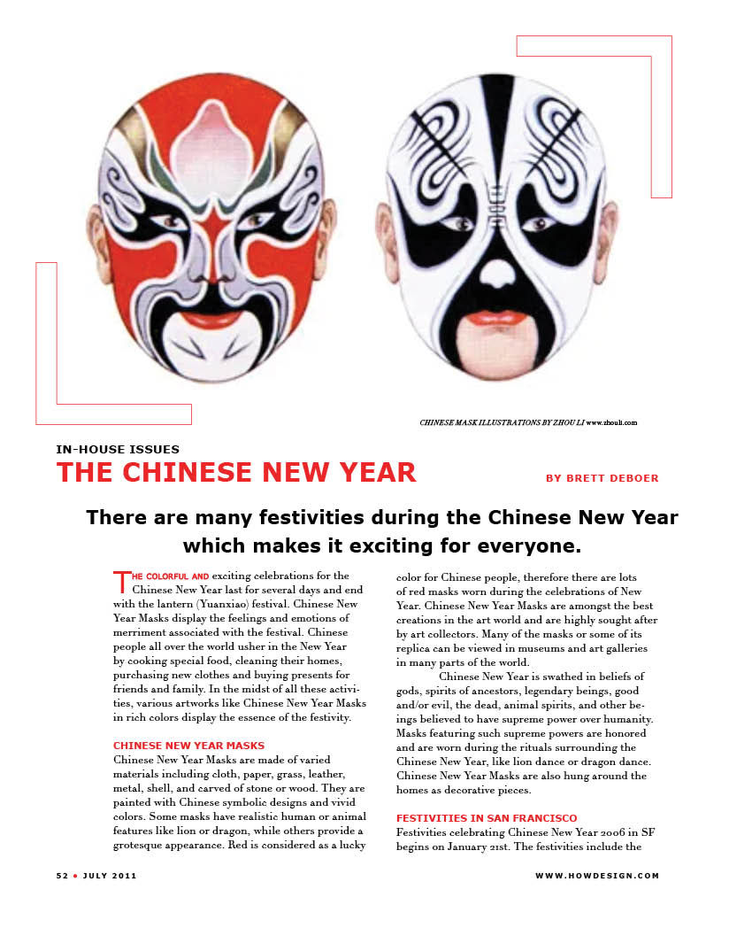
This is the start of the Chinese magazine.

This is the last page of the Chinese magazine.
Project 4
For our last project we had to make a menu for a themed restaurant. I chose to make my theme technology/AI. I imagine this restaurant would cater towards families while having entertainment for older kids and adults.

This is the cover of the menu.

This is the first page of the menu. It's also the 'about us' page.

Here's were the menu actually starts with food.

This is the last page of the menu. I chose to make the survey, which actually works.