


Intro to Graphic Design
This was my first actual design class that used computers. We weren't really taught how to use the applications, like photoshop, but we were taught some things so that we could do some basic things. More details of each project will show once the image is clicked on.
Project 1
Our first project centered around typography. We picked two quotes, one long one short, to turn into a T-shirt design. We could only have one graphic and up to two colors for each.

The first quote that I had was "Ride or Die." I knew wanted to make the first word look like a motorcycle, but was questioning what exactly to do for the rest. In the end, I decided to just make it seem like the motorcycle ran over them.

The second quote I chose was "I always carry a knife in my purse, just in case we're having cake." I chose this one since I thought it was kind of funny and something that I would send with an angel emoji as a joke. I decided to go with the angel emoji, but make it horror to make the first part of the quote seem scarier. We were only supposed to use two colors, but I ended up using three.
Project 2
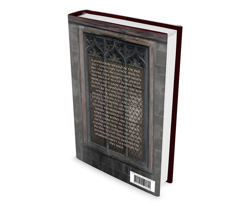
We had to make a book cover using two randomly drawn symbols for the second project. The symbols had to be included in the design of the book cover and the blurb about the story. The two symbols I got were the Celtic cross and the pi symbol.

This is how I designed the front cover. I included the Celtic cross on the door in a more subtle way since I didn't want religion as the main focus. I also used the numbers of pi as the ring of the Celtic cross. The symbol on the sleeve is part of the story that I made for this book. I hadn't used photoshop often, so I tried to keep my edits mostly simple. I mostly did color adjustments to get the result I wanted.

The back cover has the pi symbol as the part of the window, though it could be made more obvious. I decided to include a little about the author on the back sleeve to make it seem a bit more real. I had fun writing both the blurb and author biography. I used some AI generative fill to help make the pi symbol and for the top. Just like the front, I mostly just used color adjustments to get what I wanted.

This is how the book cover would look if it were to be printed and put on a book. Unfortunately we didn't get to try printing the book cover.
This is the mockup for the back cover.
Project 3
For this project we had to make a movie poster based on another student and a significant object to them. We were both a client and designer. The poster I designed was for Peter Williams, with his significant object being his camera.

Since Peter's significant object was a camera, I wanted to include pictures that he had taken himself. I also wanted to hint to a timeline to show his progress. The red string being a symbol for that. I also named the 'movie' Clearer Lens to represent him getting better at understanding how to take good photos and videos.
Project 4
Our final project had to deal with branding. We were to imagine Cadbury was releasing new chocolates and make a magazine ad and package for it. The theme and target audience was randomly drawn. I had gotten technological chocolates for a millennial audience. We could only use images that were provided to us or draw them ourselves., too.

I decided to use binary as part of the background since that's a common theme when hacking is portrayed. I also wanted to make it seem like the chocolates were being analyzed, so I made the lines surrounding the chocolates and added a short description of the chocolates. I named the chocolates Chocobytes to play off of the technology theme. I also tried to keep the purple that Cadbury uses to help tie it into their brand.

Here's a mockup of the magazine ad.

I kept the binary from the magazine and put it on the sides of the package. I also put the nutrition and address on the bottom. I figured a geometric shaped package would fit the technology theme better than if I did round package.